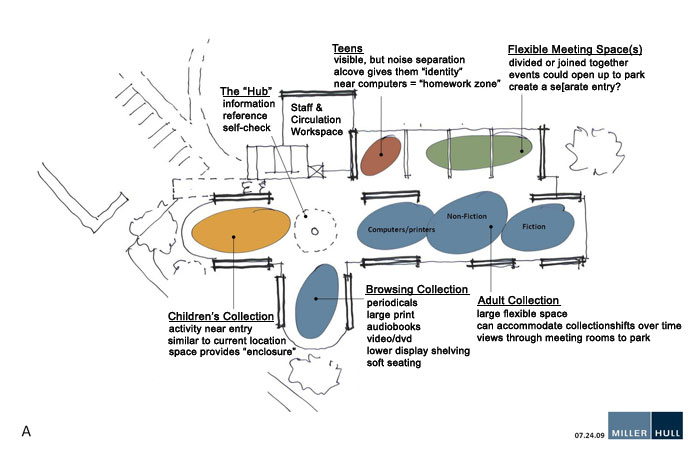
Concept Design A
Note: All designs maintain the same basic structure, extending the building to the northeast. This would allow the facility to keep its unique features as visible as possible while allowing maximum flexibility in the design.
This design keeps the children’s area in its current location. The west end of the building would be blown out and glassed in to add visibility and space. More space would also be available because the space would no longer be need for programming (i.e. story times, etc.) which would be held in the meeting space (in green).
A separate Teen space is added to meet the unique needs of that age group.
Issues with this design –
The Hub would be a staffing issue. It could be combined with the staff work area.
This design keeps small children too close to the door which is a security concern.
Views of the park would be limited to Teens and those using the study room/meeting facilities.
Send us your thoughts on Design A!
