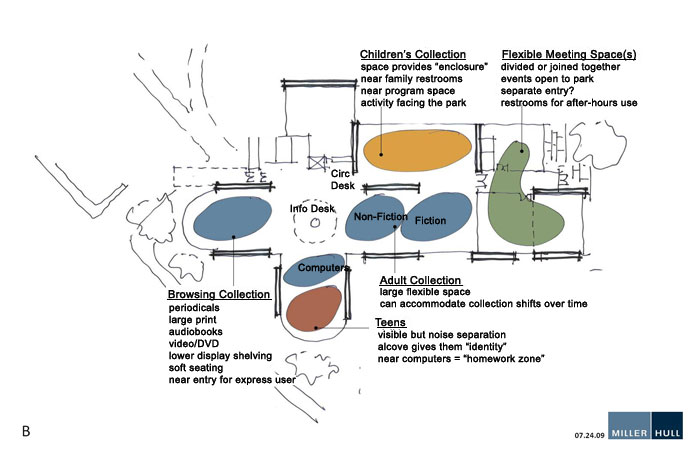
Concept Design B
Note: All designs maintain the same basic structure, extending the building to the northeast. This would allow the facility to keep its unique features as visible as possible while allowing maximum flexibility in the design.
Teens in close location to the computers seems like a natural combination.
Having the children further from the door is desirable.
The meeting space is more out of the way.
Issues with this design –
The children’s space might be difficult to manage due to lower visibility from the work area unless a window added.
Views of the park would be limited to patrons in the children’s areas.
Send us your thoughts on Design B!
