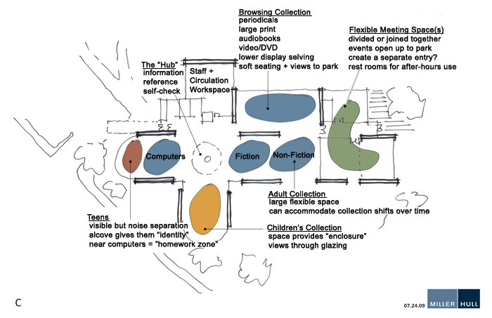
Concept Design C
Note: All designs maintain the same basic structure, extending the building to the northeast. This would allow the facility to keep its unique features as visible as possible while allowing maximum flexibility in the design.
Design C Comments
Teens in close location to the computers seems like a natural combination.
Having the children further from the door is desirable and is more visible.
The meeting space is more out of the way.
Views of the part would be available to adult users, who would likely appreciate them most.
Issues with this design –
Views of the park would be mainly in adult use areas.
Send us your thoughts on Design C!
